We’ve been looking forward to sharing our kitchen design for some time now, as we weren’t kidding in our last post when we said it’s been in the making for 18 months!
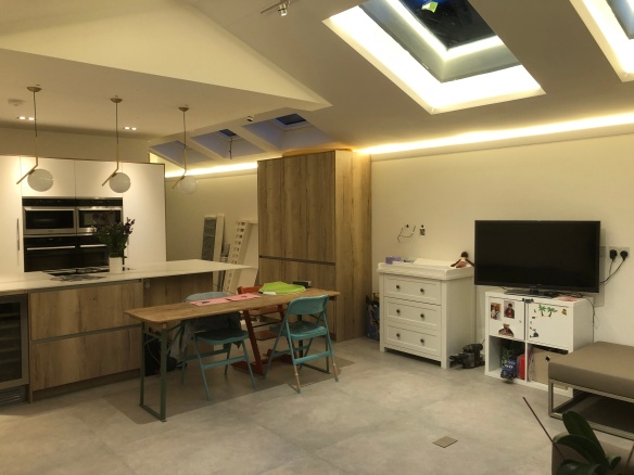
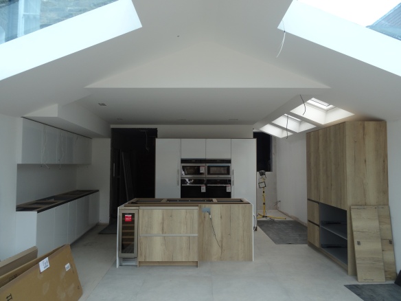
Kitchen view from the hallway
As soon as we got the final design for the extension, we started sketching out how we would kit out the kitchen. It’s the most important part of the house for us, and somewhere that we anticipate spending 80% of our waking hours there when we move in.

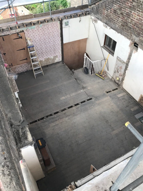
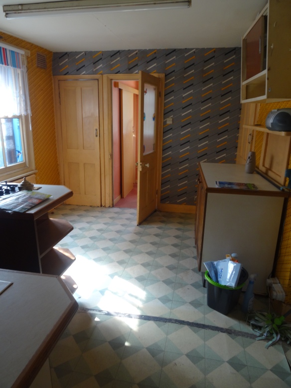
There was a bathroom at the back of the kitchen
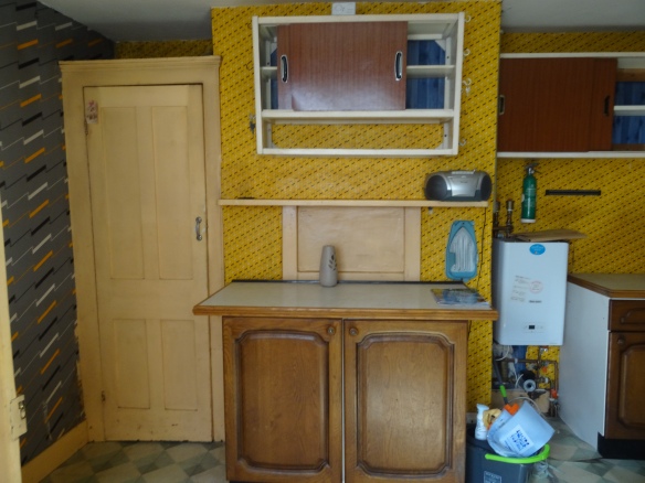
and a huge chimney brest

Kitchen before it was knocked down
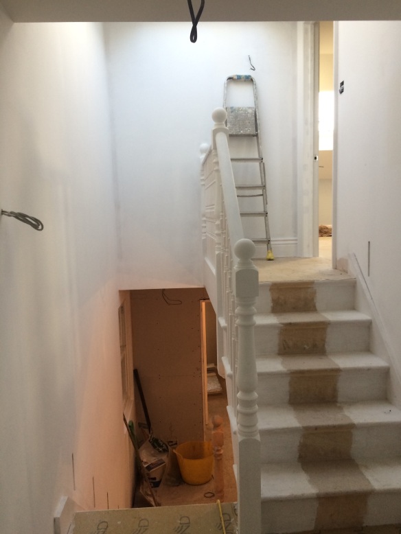
Those that have been following our blog know that the whole rear of the house needed to be knocked down, and the kitchen area was re-built wider and longer. You can see the difference on the floor plans here.
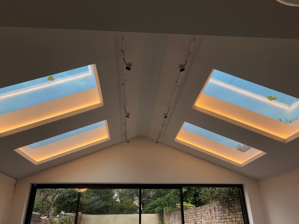
The kitchen space in the picture above is actually now where the utility room is. You’ll also see from the pictures and plans that we decided to use the delineation between where the original building ended and the new vaulted ceiling starts, as a useful boundary between the kitchen area and the social living area – which will be the space nearest the sliding doors.
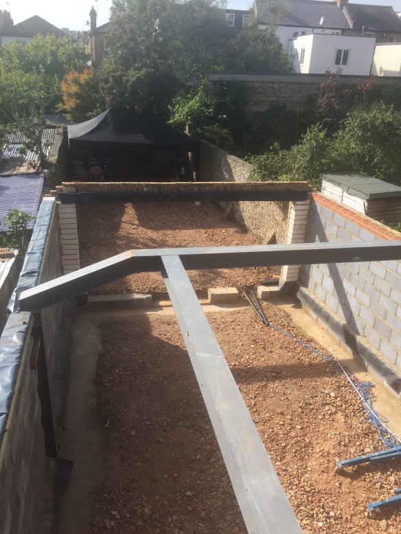
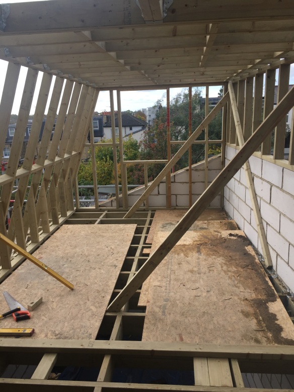
Kitchen Extension Frame, September 2017

Kitchen Extension Interior October 2017
Kitchen in April 2018
So here are lots of pictures and some words about how we made our decisions. As you can see the worktop hasn’t been fitted yet and some of the cupboards are still left but we had to share this today.
Layout
We did have time on our side to refine the layout, but we had pretty much agreed the main parts of the kitchen quite early on.
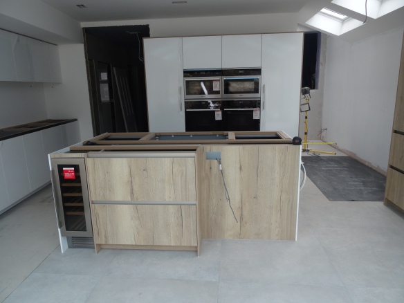
The island is 2.4m plus will have a 30cm overhang on the right
We knew we wanted an island, and due to having quite a good width (6m) we could have the island length-ways facing the garden. We also weren’t keen on having a sink in the island and preferred to put the hob there, so that when we are cooking we will have a view out to the rest of the kitchen and outside – making it very sociable.

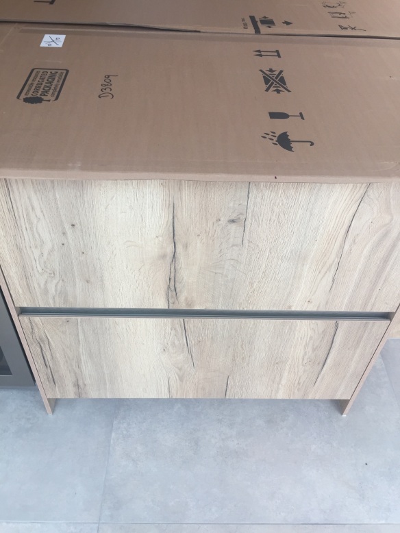
The white panels on the island were incorrect & are being replaced by the wood effect to match
Around the hob we wanted to have lots of drawers to access everything, and preferred the ovens to be behind the hob rather than under it.
The L-shape on the corner is to allow for a breakfast bar and 4 stools. We decided to have seating on the corner rather than at the long side to maximise the space for storage drawers.
We chose to have a 4-unit wide tower at the back of the kitchen which houses a floor to ceiling fridge, freezer, ovens, steam oven and a microwave.

The three appliances you see with the white stickers on are from the Miele outlet in Oxfordshire. It is worth a visit if you are kitting out your whole kitchen. (we also got our washer dryer from there!)

One of the benefits of deciding the kitchen layout very early on is that you can make the room fit perfectly to the units. This tower unit combination is 2.4m wide plus the side panels – and we did need to build out the wall to the side so that it would fit.
It is important to have a good supplier that will come out and assess the room once it has been built and plastered. There were only a few changes to the structure of the kitchen but they did make an impact of the cabinet layout and heights – mainly of the sink run here:

We originally had this longer, with another tall cabinet on the right side for a larder, but then we had to build out the wall to make it square – which we blogged about here.
This is where the sink, Quooker tap and dishwasher are. We also decided to have the plug sockets at the sides rather than at the back so that we can have an uninterrupted splash-back.
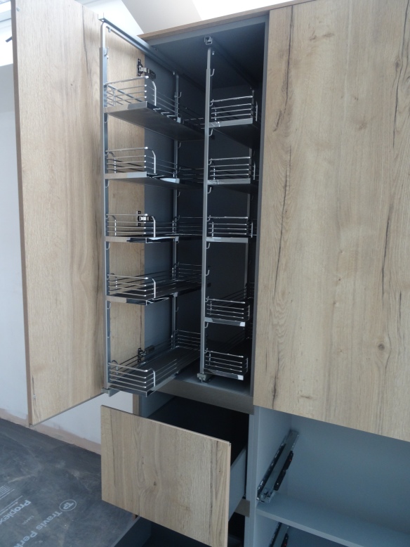
On the other side of the kitchen, we added a larder unit:

This has one 50cm unit with deep drawers at the bottom and a larder pullout at the top:
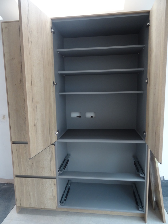
On the other side the top doors open where we will have a toaster and blender, breakfast items etc, and plenty of storage space in the drawers below for plates and bowls.
Style
We debated at the beginning on whether to go for a modern look or more traditional shaker. For our last renovation, we went for solid wood, bespoke made shaker units, a range cooker and cup handles.

We went for a contemporary, handleless kitchen this time because the shape of the extension is itself a very modern look.

The worktop will be porcelain with a marble effect
We wanted to steer away from the gloss white look because of the space I thought it would look too sterile, so when our kitchen designer Libra from Eclectic Kitchens, showed us this wood effect we both instantly knew it would work.

When I saw this as I came in to the kitchen I instantly went to touch it. It’s an oak wood veneer and feels amazing. The white units are all a matt finish. It took a while to agree which units would be wood and which would be white – but we got there in the end! The end panels of the island will be replaced for wood but the wood frame around the tall units is intentional.
The kitchen brand is Rational, which is a German brand known for their contemporary kitchens.
We also love the grey interior and the handles
We think the wood really softens what could have been a very cold looking kitchen. It’s also why we have chosen more natural stone tiles and worktop.
Kitchen Supplier
As usual with us (mainly Axe), a lot of research was done to find the best company for the best value. Once we decided to go for contemporary units we then had to set a budget. A lot of the structural costs went in to getting the kitchen space right, and we both agreed that investing in a good quality kitchen from the outset was the right choice for us. But our budget ruled out a lot of the super high end places like Roundhouse and Poggenpohl.
We went with Eclectic Interiors, and we were really glad we did, because not only were they able to come to our budget, but they are also very local to us. This meant that we could easily pop in and discuss any changes to the design, but also they were available to come to site when things had progressed. When it came to fitting the units everything was communicated to us clearly, and the designers and fitters worked together well.

They also have a really great 3D visualiser that helps so much when you are like us changing unit colours and worktops to be sure they work!
K


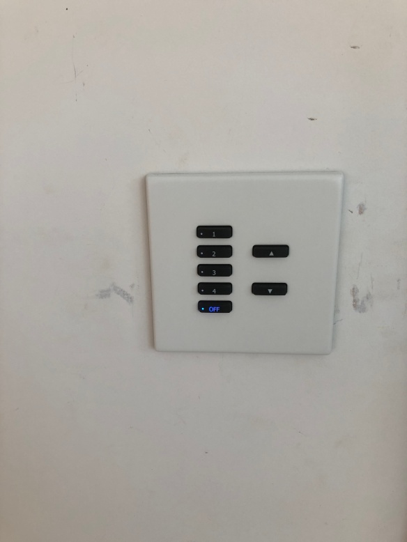
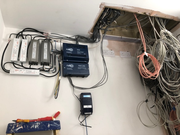 Here’s the switches